Cover photo editing and selection
In this post what I'm trying convey is how the main cover photos that I took can be used as a cover and fit well with the theme of sports magazines through editing and designing a cover using the software Canva.


As I begin editing I enter the canva website and I choose a layout for a magazine cover and then I bring in the picture of the football from my google drive and fit it into the page. The next thing I do is try and figure out a masthead font. I had the font "sportsworld" as an idea for the font so I put it in. I wanted the masthead to be "The Big Sport", because this was the masthead and also the "company" that makes the so called "magazines". After putting my masthead in I tested out where I wanted the the masthead to go and I decided that the middle near the football. After aligning the picture, I changed the font of the masthead from sports world to bungee shade so that it came off much cleaner. After changing the font, I also changed the color, which I used red for but then it came off too bright so I changed it using to color wheel to a red that fit better and could be seen better. I chose red because of how its bold and aggressive. The cover lines and the selling lines I chose around the super bowl
and football and I chose the fonts from the preset fonts. The picture above is the preset texts.
 This is the finished cover.
and football and I chose the fonts from the preset fonts.
This is the finished cover.The next cover I used was the baseball and for this I basically did the same thing as the football cover and for the masthead cover I used bungee shade as the font and instead I used the color because It compliments the color of the baseball. For some of the coverlines I used the latest news in the MLB and I also used the color wheel for the Freddie Freeman coverline so that it could be seen. The other ones I used basic colors and I also used present fonts for all of the coverlines. 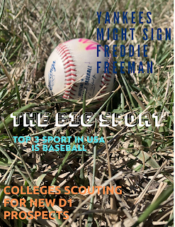
Finished cover.
For the 3rd cover I used the shoes and basketball and I also used the same masthead font and the same masthead title. The contents such as the coverlines are all relevant information in the NBA currently, which I used the latest NBA news for. The coverline fonts were once again all preset fonts which I thought would fit in the cover. The colors for everything are basic colors or one of the suggested colors.


Comments
Post a Comment