color theory
Color theory is the rules and guidelines that designers use to communicate with an audience visually. Color theory is also how you arrange colors and create schemes. In other words color theory can be seen as the science and art of using color. Color theory includes different messages that colors indicate and methods used to replicate the color. Colors can be put on a color wheel and be broke down into 3 main categories which are primary colors, secondary colors, and tertiary colors . Color wheels are pretty simple to understand, its a tool used to illustrate colors around a wheel and help show the connection between the primary, secondary, and tertiary colors. Going back to color theory though, color theory is very essential for anyone trying to create a piece of art no matter what it is. Colors are super important for helping create uniqueness to whatever your working on. Colors help with branding ,marketing, and sales because it can help you make effective and creative marketing decisions. It helps with this because you know how colors work, then you can make right color decisions because colors also provoke emotion. Lets dig deeper into different colors and what they entail.

The picture above is a color wheel, which as stated before, is a tool that can help illustrate colors.
In the color wheel the primary colors are red, yellow, and blue. The secondary colors are green, orange, and purple. And the tertiary colors are the colors that can go together. Primary colors are the building blocks for all other colors and they can be created by mixing other hues. Secondary colors are colors that can be created by mixing 2 primary colors. On color wheels they are located between 2 primary colors and for example red and yellow make orange and if you mix other primary colors then they make the secondary colors. Tertiary colors are colors that you get if you mix a primary color and a secondary color together. Another thing that you have to understand about colors is that they can cause different emotions. Lets start with Yellow.
Yellow
The color yellow is a color that can bring out happiness, aggressiveness, energetic, or even complex feelings. Some see yellow as happiness because of how it can be seen as a color that is associated with sunny days and fun times. Others might see it as a color that gives them bad memories. It can also be aggressive like angry and mean.

A picture like this is something that most of the time can be seen positively by most people but others could have different feelings about it because they yellow can trigger feelings that are not positive. Yellow is also seen to be the color that affects the left side of the brain the most causing strong analytical thinking. Yellow causes increases mental activity, heightened awareness, increased metabolic rate, and increased energy levels. Yellow also causes increased irritability, anger, and high levels of aggression, and agitation.
Orange
Orange is usually affiliated with high energy and energetic attitudes and it stands out like yellow and red. The thing with orange is that most people love it or hate it . It also important to note that orange is viewed differently in different cultures. because in Asia orange might be perceived as a color that is peaceful but in the united states the color orange is affiliated with prison clothes.


The two pictures above both contain orange but have completely different meanings behind them. The thing is that orange like any other color is all perceptual. Different forms and shades also have feeling associated to them. Like orange with hints of gold means self control. and something like burnt orange is aggression, pride, and tension.
Red
Red is a color that a lot of people have different opinions on because it signals a lot of things like anger, aggression, danger, but also love, energy, and health and much more. Red is the 2nd biggest attention grabber right after yellow. A lot of things in our modern world are associated with red like stop signs and red lights which can indicate the danger feeling towards red. During valentines day the biggest color of the day is red because of how it is associated with the idea of love. In the movie "Inside Out", the feeling "Anger" was red and also in cartoons and movies, when a character gets angry or mad the character gets red for comedic effect. American red cross is a non profit origination that uses the color red and this is connected to health. These are just examples of how red can be seen from different standpoints and different feelings.


It is very easy and clear to say to that the color red can be seen as the color that promotes the most passion and the most emotion. The color red is super deep because it can be seen from many different standpoints. Many companies use the color red because how it creates a sense of urgency and might make the viewer react to the product faster. Like if McDonalds uses the color red a lot in one their ads, then the viewer might get up and go get McDonalds.

This picture shows a lot of companies that use red and a lot of them are easy identifiable because they have made an impact on our society. Red also stimulates mental activity and muscle energy. A lot of companies also use red because how it is bold and energetic. This might be why sports illustrated and ESPN uses red a lot. Red can help show that boldness and aggression that sports magazines like to give off.
Purple
With the color purple, it represents Wisdom, bravery and also different shades can represent sadness and frustration. Lighter shades of purple can also represent light hearted ,romantic energies. A lot also like to say how purple is associated with spirituality, the divine, and royalty. One of the best examples of bravery is how in the military you can earn a purple heart. Another thing is that visually purple is very hard to differentiate.

Blue
Blue is a color that is linked to the feeling of calmness and peace but also sadness, security, loyalty, peace, freedom, and much more. When advertisements want to show security they use the color blue. A lot of the times the color of blue can also show depression and when most people think of the negatives feelings of the color blue it is sadness. 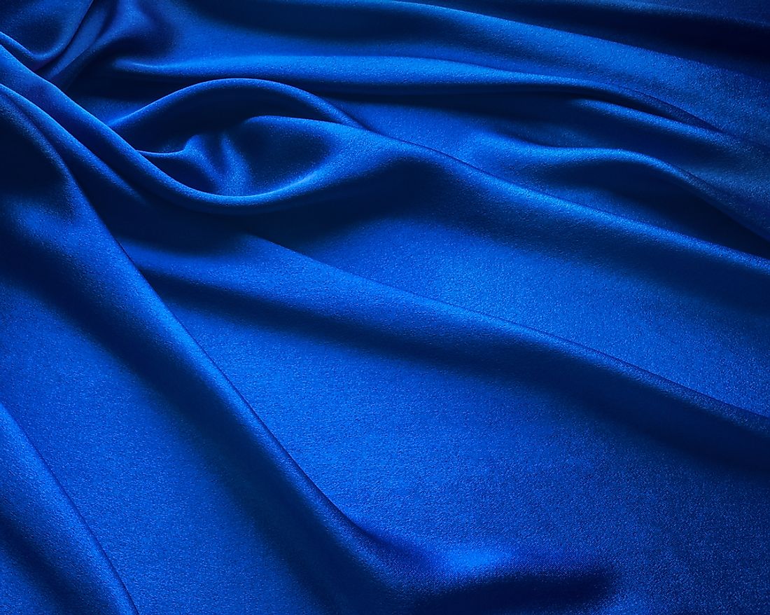
Green
Green is usually a color that is connected to feelings of peacefulness, rest, security, but also negative feelings like envy and materialism. A lot of people when they see green have moods of refreshment, optimism, and a lot of companies use it to show growth and security. 
All the companies above use the color green because they want to seem down to earth and show how they want to grow.
These are all the main colors on the color wheel and what feelings and psychology are behind them.
Digging deeper into sports magazines, the sports magazine sports illustrated uses the colors blue and white a lot. They use blue a lot because the blue really compliments the white. Sports illustrated also uses orange a lot because of how blue and orange are also complimentary colors. Blue and orange are also light colors that show strength, energy, and movement. Another big sports magazine is ESPN and they use the colors red and white. The red is good because it shows the boldness and aggression that a lot of sports want to convey. ESPN also uses the color red because it shows power and passion while as the color white is purity. Originally ESPN used the colors orange because it showed agitation and excitement. Now they use white because of purity and the purity is also involved with honesty and integrity that ESPN wants to promote because of younger audiences viewing a lot of athletes as role models.
Sources
https://99designs.com
https://www.complex.com/style/2014/08/color-theory-facts-you-should-know/there-are-three-differenc-types-of-colors
https://www.verywellmind.com/the-color-psychology-of-yellow-2795823#:~:text=Energetic%3A%20Yellow%20can%20also%20increase,cry%20more%20in%20yellow%20rooms.
https://medium.com/@davidkellyuph/the-psychology-of-color-yellow-fc9420cf2ff7
https://www.verywellmind.com/the-color-psychology-of-orange-2795818
https://medium.com/@davidkellyuph/the-psychology-of-color-orange-5d4c2c513cfe
https://www.colorpsychology.org/red/
https://www.verywellmind.com/the-color-psychology-of-red-2795821
http://divvyonline.com/
http://587.claudiastrong.com/sports-illustrated-color/
https://blog.logomyway.com/espn-logo/

Comments
Post a Comment