Magazine tips and layout designs
Tip 1 Enthusiasm
A good tip for creating a good magazine is having great enthusiasm and passion for what your working on. If working on something you do not like, the intrigue for the project is going to be a lot less and the work will be less fascinating, sloppy, boring and overall worse then what could have been if you liked the topic. If the topic is a lot more boring for you, then the best thing to do is try and make a connection to your topic and or try or your best. Putting in your best effort and work never hurts so make it the best you can.

Tip 2 Make your contents page unique and fun
Putting in effort and creativity to a contents page, can shape a lot for your magazine because it can determine if a reader would like to continue reading the magazine. Like, if a person at maybe their local grocery store, sees an interesting magazine the cover will allow them to pick it up but seeing the contents of the magazine is what gets them to buy and read it. Being creative with a contents page shows how creative you can be and in the end nobody wants to read a boring content page.

Tip 3 Multimedia
The information in the magazine should never make the reader feel like they are reading a book, so the best thing to do is include some different things. Adding statistics and details can be very interesting, and another way to do this is by using infographic type of designs. Doing this by creating a balance between the text and the infographic can make good rhythm and making the picture flow in the page without forcing it is a very good.

Tip 4 Adding contrast
Having color contrast in your magazine page can be very visually appealing. Having a color contrast makes it pop out a lot more and it allow you to draw more attention from the reader. Also, using different fonts can make the page pop out more. When creating contrast the text and what your trying to pop should not being fighting for the space. The thing your contrasting has to compliment each other because at the end of the day if the magazine is visually nice then that can get the reader to keep reading.

Tip 5 Making a good cover
To put it in simple words the cover is one of the most important pieces that you can create. Not only does the cover have a very significant effect on your magazine but it is also what persuades a reader to pick it up in the first place. The cover should be relatable, noticeable and unique. For example having a cover of just a basketball could entitle some to pick up the magazine but think of a magazine that has a picture if Lebron James arguably the face of the NBA right now. This would make is a lot more appealing because NBA fans, basketball fans, and sports fans would be a lot more interested. At the same time, dont make your cover a flurry of things. It should be simple but not to simple it should follow a key balance. Good magazine usually follow one main heading, one major sub heading, and multiple other subheadings that aren't as big.

Tip 6 Create a style and stick to it
Having good continency is going to be very crucial. Having a good theme can help keep flow otherwise it can look like a mess. Having these things can help with consistency color scheme, typography, shape and graphics, background color, page numbering and headings.

Tip 7 Having good font and type use
The magazine you are creating should have good alignment to give a more professional feel. Making sure everything is left to right makes it neat and easy to read. Even having subtle misalignments will be spotted by the reader and that will be discredited. Also using too much information in one small space can be overwhelming and not look good. Making it fun and easy to read is what your goal is as well when making a magazine.

Tip 8 Using white space
Having a good amount of white space is good, it helps keep your magazine look clean and aesthetic whilst not overdoing too much and making the page look too wordy. Too much reading can get boring for a reader and they often feel like it is too much. Having white space can also help a reader draw their attention to something important in the layout. white space also does what a lot of magazines should do and that is create that balance and consistency.

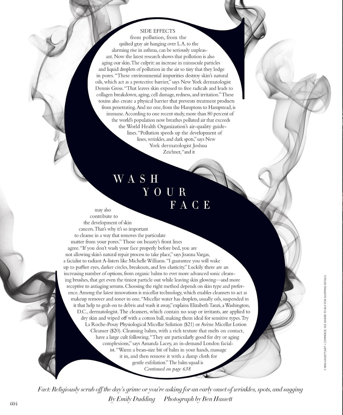
Tip 9 Text wrapping in unique ways
Even though it can be unprofessional in some ways, its still a magazine and magazines are a work of art. Using unusual text wrapping is a great way to draw a readers eye, because it just looks really cool! Text wrapping helps show creativity and uniqueness to your magazine, and helps combine a photo and a text into one.

Sports Magazines
In sports magazines, your going to have some pages where they show statistics and infographics. This is because sports magazines use this to show as much information as they can about players or teams. With good amount of white space used in sports magazines, they help draw the attention to pictures or stats and make the page look neat. Not always do sports magazines use the same three or so colors through out there magazine, this is because a lot of colors need to be used to show the feeling they want to produce, which is that energetic and aggressive feeling. With lots of different teams using different colors its also not going to be easy using the same color theme.
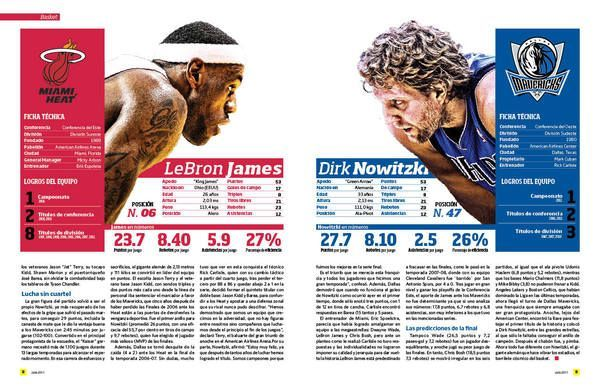

Even in the image above you can see how the cover features a big masthead with a lot of other subheading following.
Sources
https://www.creativebloq.com/advice/editorial-design-tips
https://www.g2.com/articles/magazine-layout
https://www.magloft.com/blog/incredible-magazine-design-tips/
https://www.indesignskills.com/inspiration/magazine-layout-design/


Comments
Post a Comment